Pottery Rat is a handmade pottery business specializing in playful, artisan ceramics. Owner Megan Ratslaff came to me seeking a full brand identity package that could bring her clever business name (a playful nod to her last name) to life through a hand-drawn rat illustration. She wanted a brand that felt cute, cartoonish, nerdy, and fun, while maintaining enough simplicity to work across various applications.
Process
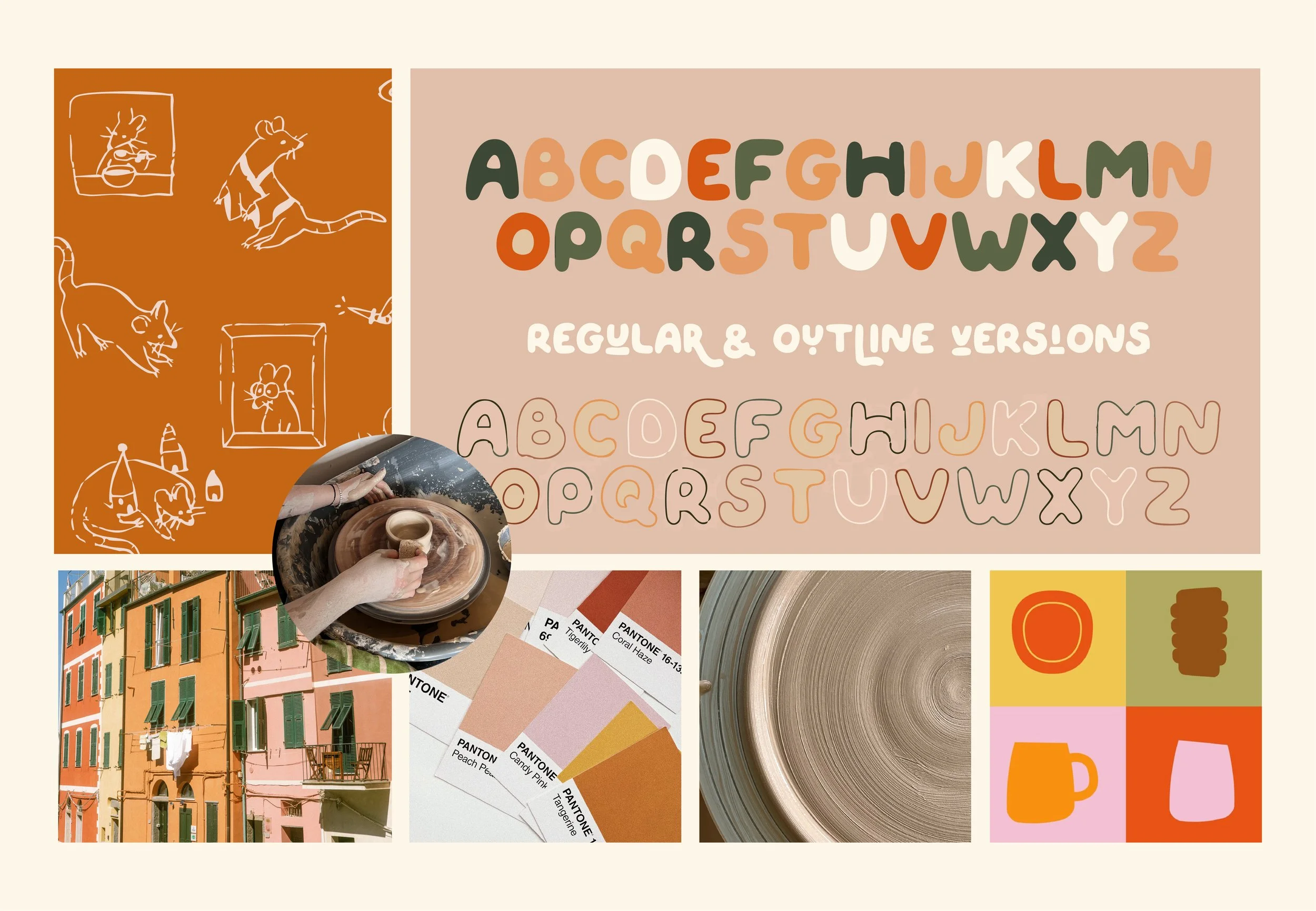
I began by interviewing Megan about her vision for the brand, gathering keywords and references that spoke to the personality she wanted to convey. From there, I developed a mood board that explored textures, color palettes, typography styles, and illustration approaches that balanced handmade charm with contemporary design. The goal was to find a sweet spot where playful energy met clean, professional execution.
POTTERY RAT
·
POTTERY RAT ·
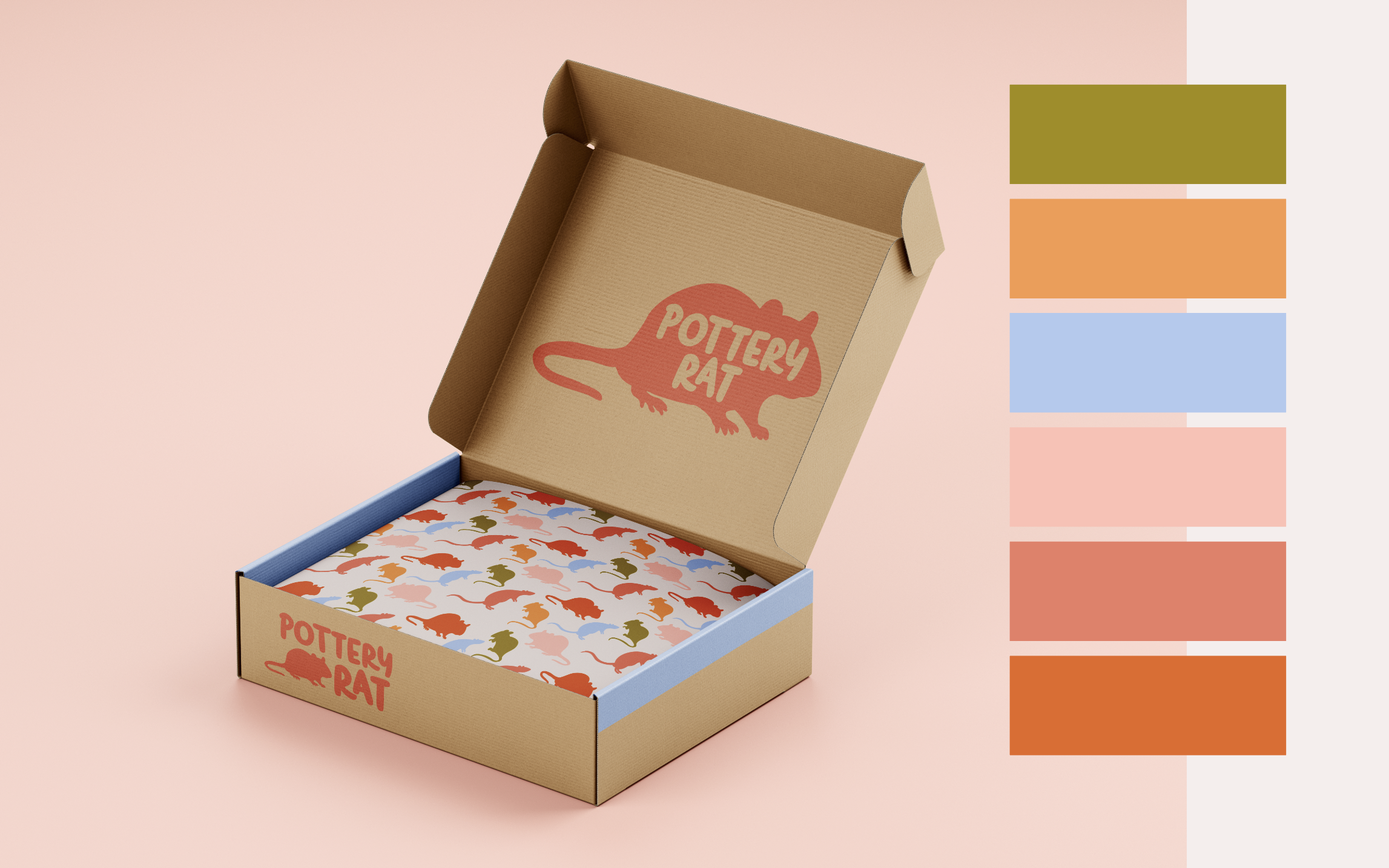
I developed a vibrant color palette of chartreuse green, coral orange, sky blue, and soft pinks. These colors were chosen to emphasize the fun, cartoonish side of the brand while bringing in the cute, approachable energy Megan wanted. The multi-color system gives her flexibility to mix and match across different applications without losing cohesion. The typography (a modified bubbly font) reinforces the playful, handmade aesthetic while remaining clean and readable. To extend the brand further, I designed a custom pattern using the rat icon repeated in various brand colors, adding visual interest to packaging and promotional materials.
Outcome
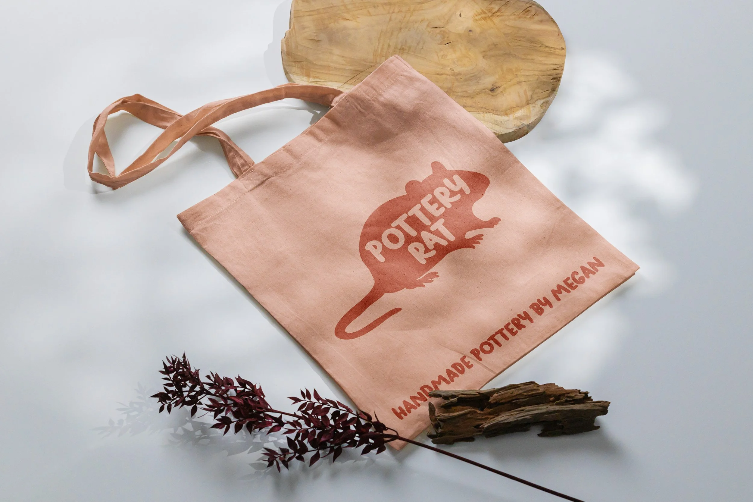
The Pottery Rat brand identity strikes a balance between handcrafted warmth and polished design, giving Megan a flexible system that works across craft markets, social media, packaging, and even as a stamp on the bottom of her pottery pieces. The brand successfully captures the personality of her work while standing out in the handmade ceramics space.
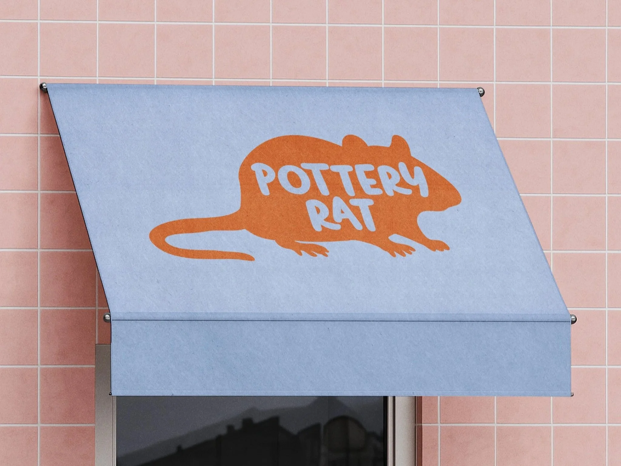
For the centerpiece of the brand (the rat illustration) I started with hand-drawn sketches to capture an organic, approachable feel that would echo the tactile nature of Megan's pottery. Once I landed on the right personality and pose, I translated the sketch into a clean vector, preserving the chunky, cartoonish quality while ensuring scalability and versatility. The result is a friendly rat silhouette with just enough character to feel handmade without losing clarity.
The final brand package included multiple logo variations designed for different contexts. The primary lockup features the wordmark integrated directly into the rat's body, creating a unified mark that's bold and memorable. For smaller applications (like pottery stamps and social media avatars) I created an alternate version with the rat positioned beside the text, ensuring legibility at any size while maintaining brand recognition.
Brand Moodboard