Logo System & Design Direction
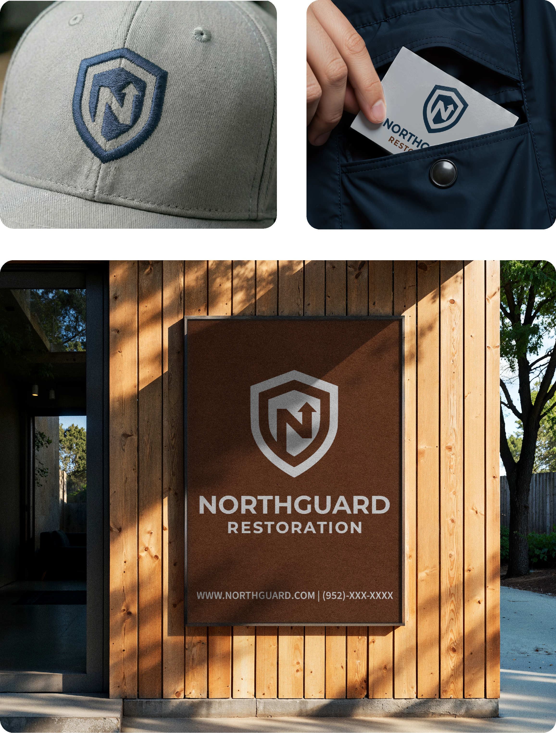
The final logo solution combines two powerful symbols. The shield represents Northguard's core philosophy: protection, security, and the guardian mentality of treating every home as if their own family lived there. Within the shield, the letter "N" doubles as an upward arrow, symbolizing both the company name and the forward movement, growth, and guidance that Northguard provides homeowners through their restoration journey.
This dual meaning allows the logo to tell the complete Northguard story in a single mark: we protect you, and we guide you forward.
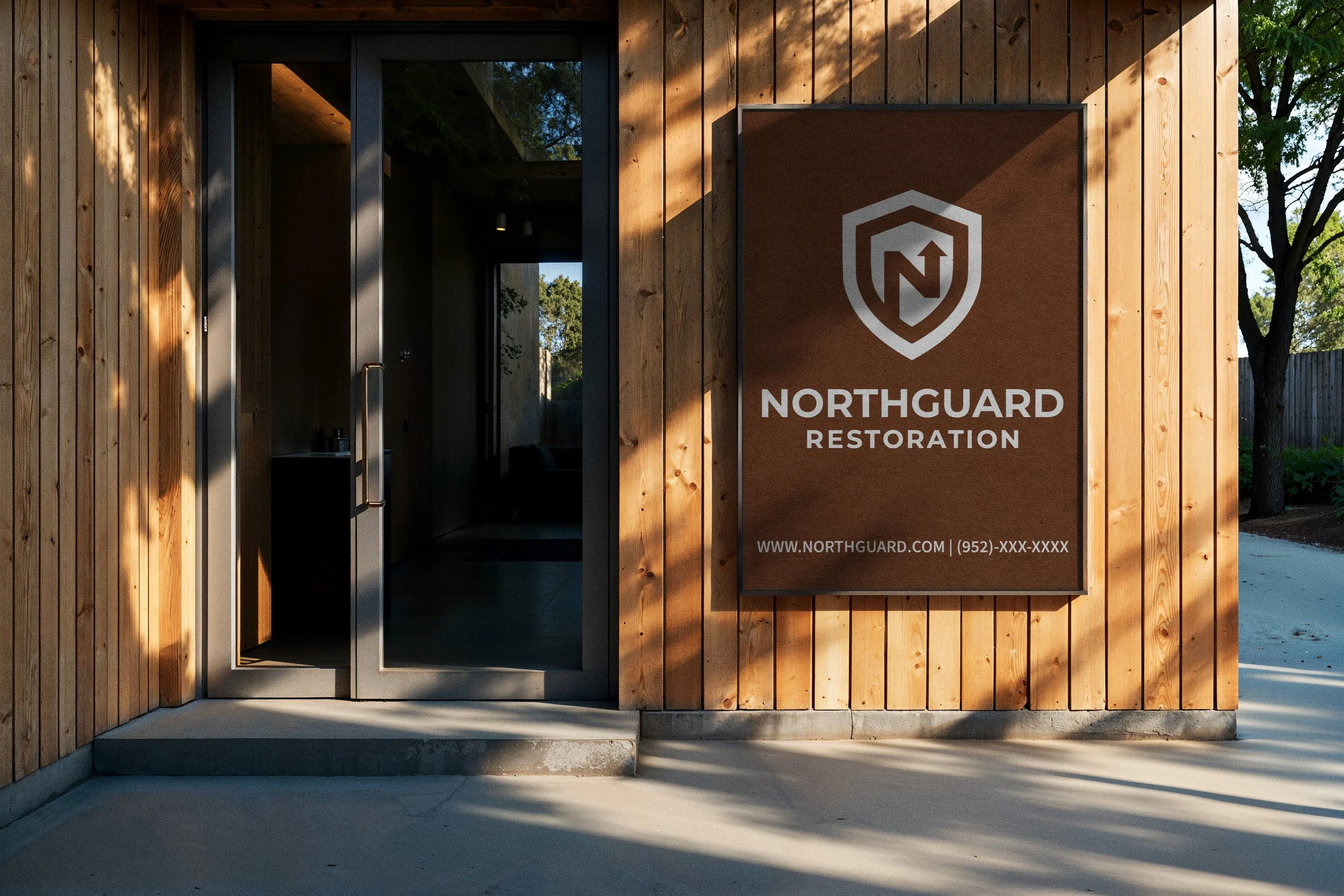
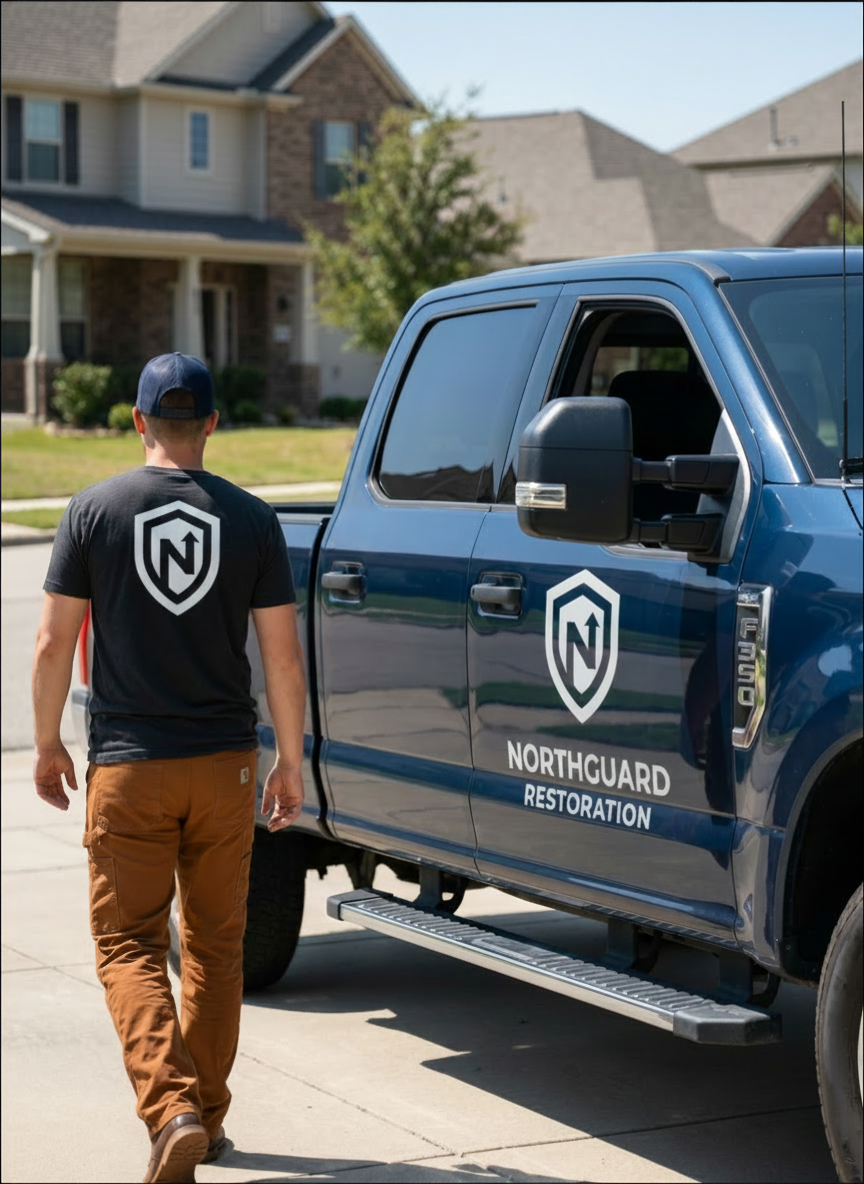
The logo was tested across multiple applications and mockups to ensure it remained clear, professional, and trustworthy at any scale, from business cards to signage.
Color & Typography Strategy
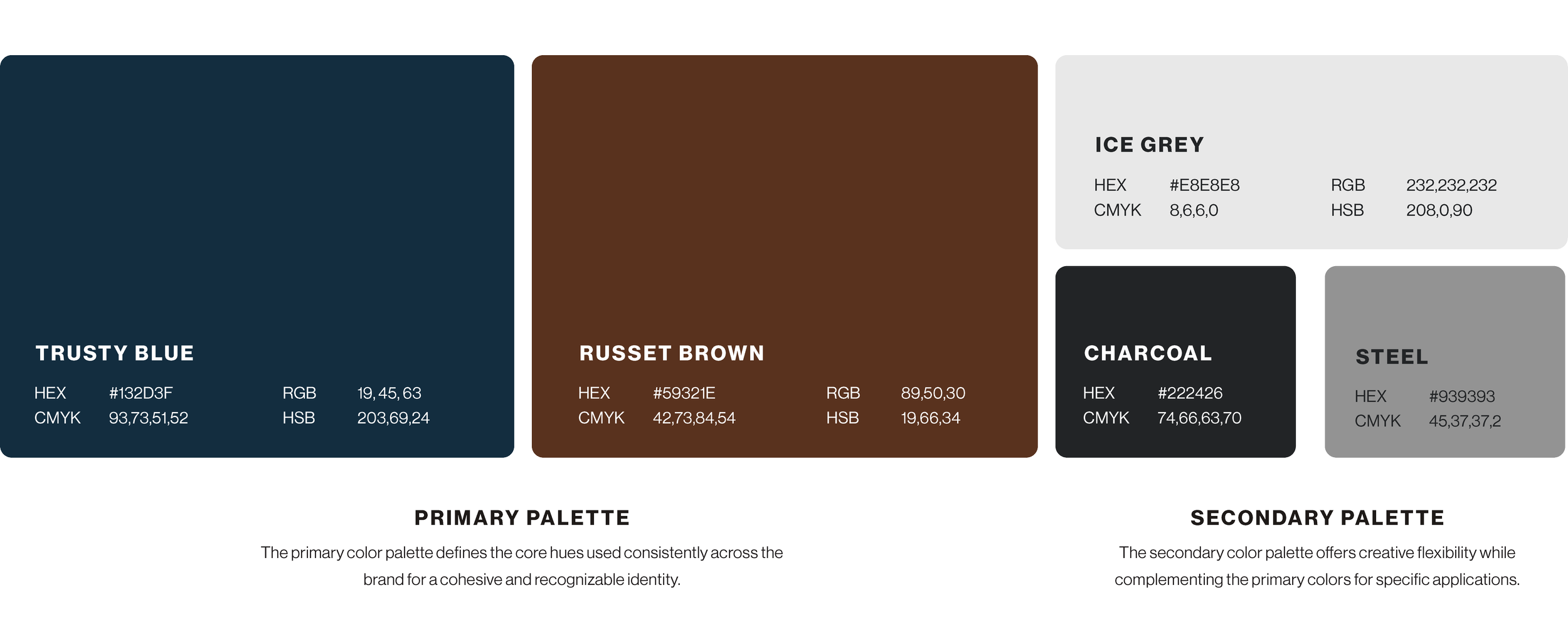
The color palette was engineered to differentiate Northguard from competitors while reinforcing their core brand promise. Trusty Blue serves as the anchor color, communicating stability, reliability, and trustworthiness. Russet Brown introduces warmth and a hardworking, dependable quality that humanizes the brand and connects to the hands-on nature of restoration work. Charcoal keeps the system grounded and clean, while Ice Grey balances the palette to prevent visual heaviness.
Together, these colors create a sophisticated, professional appearance that stands in stark contrast to the bright primary colors typical in the restoration industry. The palette itself becomes a differentiator: signals that Northguard is thoughtful and worthy of trust.
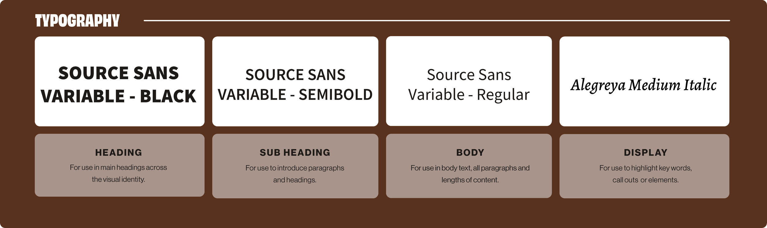
For typography, I selected a bold, sturdy typeface that conveys dependability and strength without feeling cold or corporate. The font reinforces Northguard's promise: we are capable, reliable, and here to support you.
Northguard Restoration
Northguard Restoration is a full-service storm damage restoration company founded on a guardian mindset: protecting homeowners not just their properties, but also their peace of mind throughout the restoration journey. When Northguard's founders approached me, they had an idea of a logo concept but needed a complete, professional brand identity to establish credibility in a competitive market and communicate the trust and dependability that sets them apart.
Their vision was clear: "We treat every home as if our own family lived inside. We watch over the property, the process, and your peace of mind." This philosophy needed to translate into every visual touchpoint.
Process & Discovery
I began by analyzing Northguard's competitive landscape and discovered a significant opportunity. Most restoration companies relied on generic primary-color logos featuring houses or storm imagery. Northguard needed a visual identity that felt distinct, trustworthy, and professional, while authentically reflecting their guardian mindset and commitment to homeowner advocacy.
Starting with the logo concept Northguard provided, I refined the proportions and spacing, which had felt awkward and incomplete in the original sketch. I developed multiple logo iterations, each exploring how to balance two key brand attributes: protection (the guardian mindset) and forward movement (guidance and advocacy through the restoration process).
Outcome & Impact
The Northguard team's response was enthusiastic. They saw the work and immediately recognized that the identity captured exactly what they needed to communicate. After the initial presentation, only minor revisions were requested before final approval, which speaks to how well the strategic direction aligned with their vision.
The brand successfully solves the core challenge: Northguard now has a professional, distinctive visual identity that communicates trust, protection, and guidance in an industry saturated with generic alternatives. Their logo stands apart immediately, and the cohesive color system reinforces their unique position in the market. As their website launches and marketing efforts begin, the brand identity will serve as a strong foundation for growth, helping homeowners in crisis recognize and trust a restoration partner that truly puts their needs first.
Brand System & Applications
Beyond the logo, I developed a comprehensive brand identity system including a complete color palette, typography guidelines, custom brand pattern, and extensive visual guidelines. The brand pattern extends the visual system into textures and backgrounds, adding sophistication to any application while maintaining visual consistency.
The full visual guideline document provides detailed specifications for every application, from business cards and letterheads to web and marketing materials. A condensed quick-guide version was also created for the marketing team, making it easy to apply brand standards consistently across campaigns and touchpoints.
Deliverables included:
Primary, secondary, and alternative logo variations
Complete color system with technical specifications
Typography guidelines and hierarchy
Custom brand pattern
Full visual identity guidelines
Marketing quick-reference guide