Country Lane Botanicals
Country Lane is a holistic home and wellness brand creating hand-crafted herbal and botanical products, including soaps, oils, tinctures, and salves. Owner Madi approached me needing a comprehensive brand identity that could speak to her target audience of crunchy moms, conscious consumers who care deeply about the contents of their skincare products, and anyone curious about transitioning away from conventional chemical-based home goods. She wanted a brand that felt holistically minded, carefully crafted, simple, and traditional.
Process
I began by developing a mood board that explored botanical references, earthy and holistic aesthetics, packaging inspiration, typography styles, and a natural color palette. Madi knew from the start that she wanted a plantain illustration as the centerpiece of her brand and had a strong preference for serif typography. This gave me a clear foundation to build a visual identity that would feel both timeless and rooted in nature.

Brand Moodboard

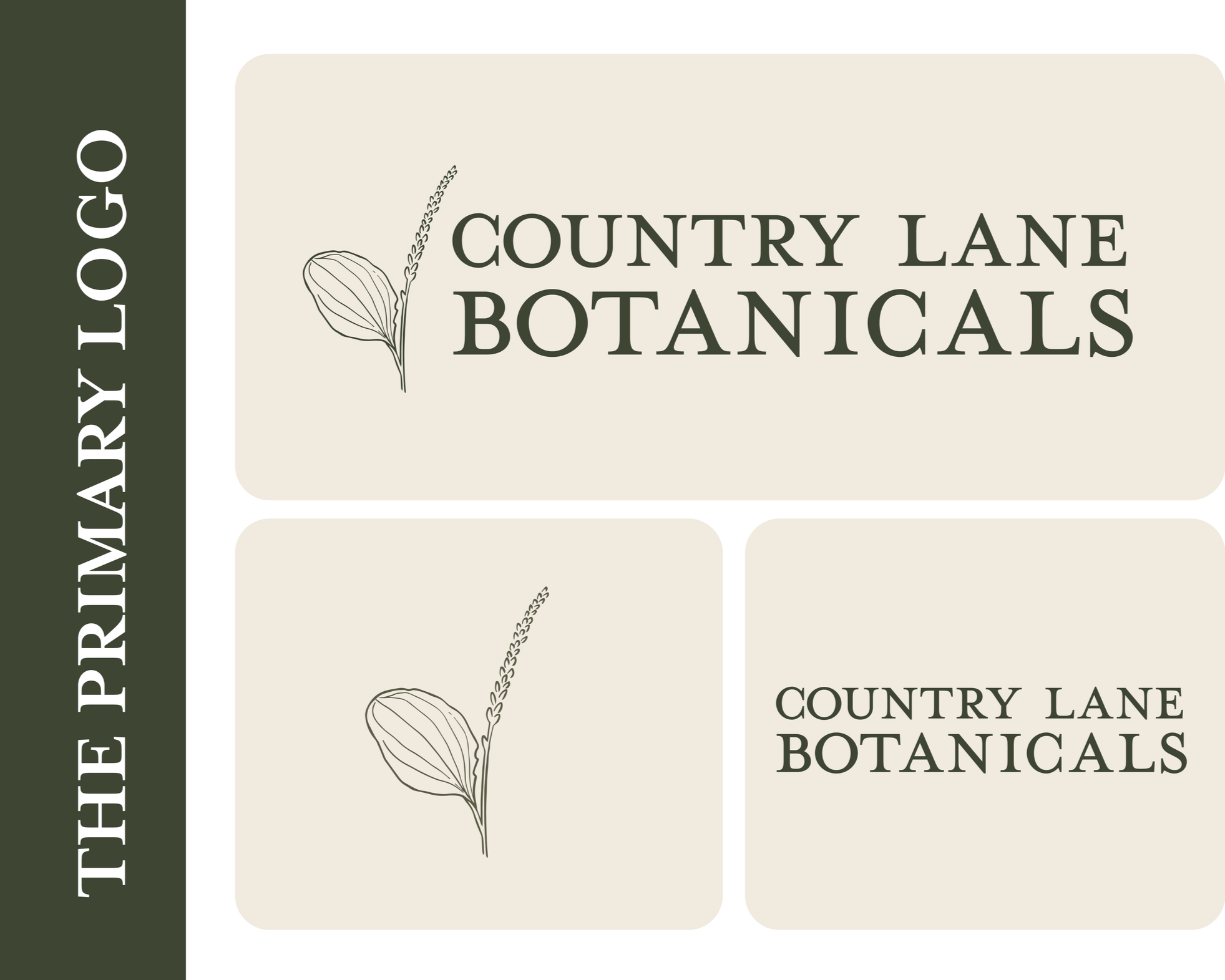
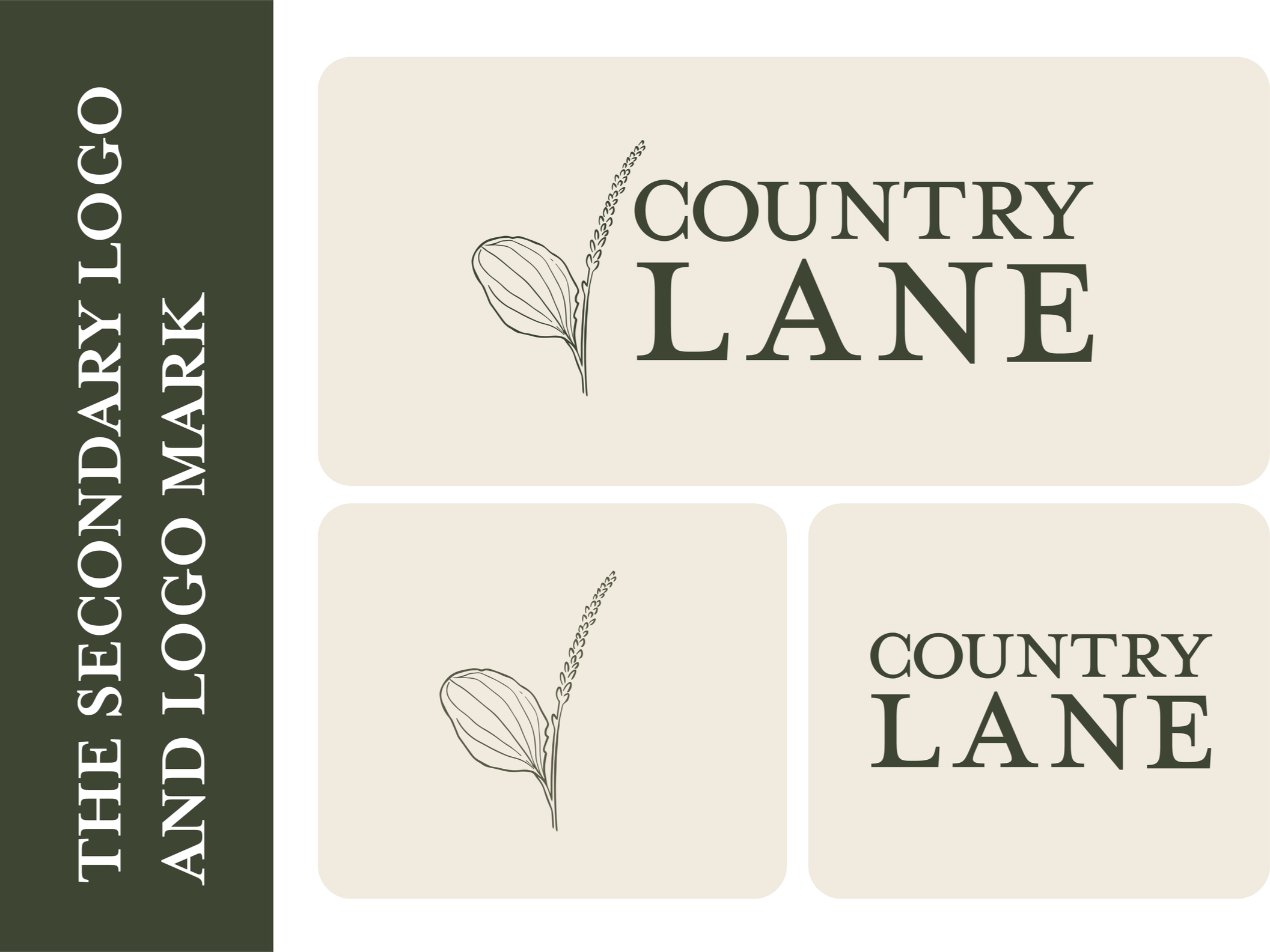
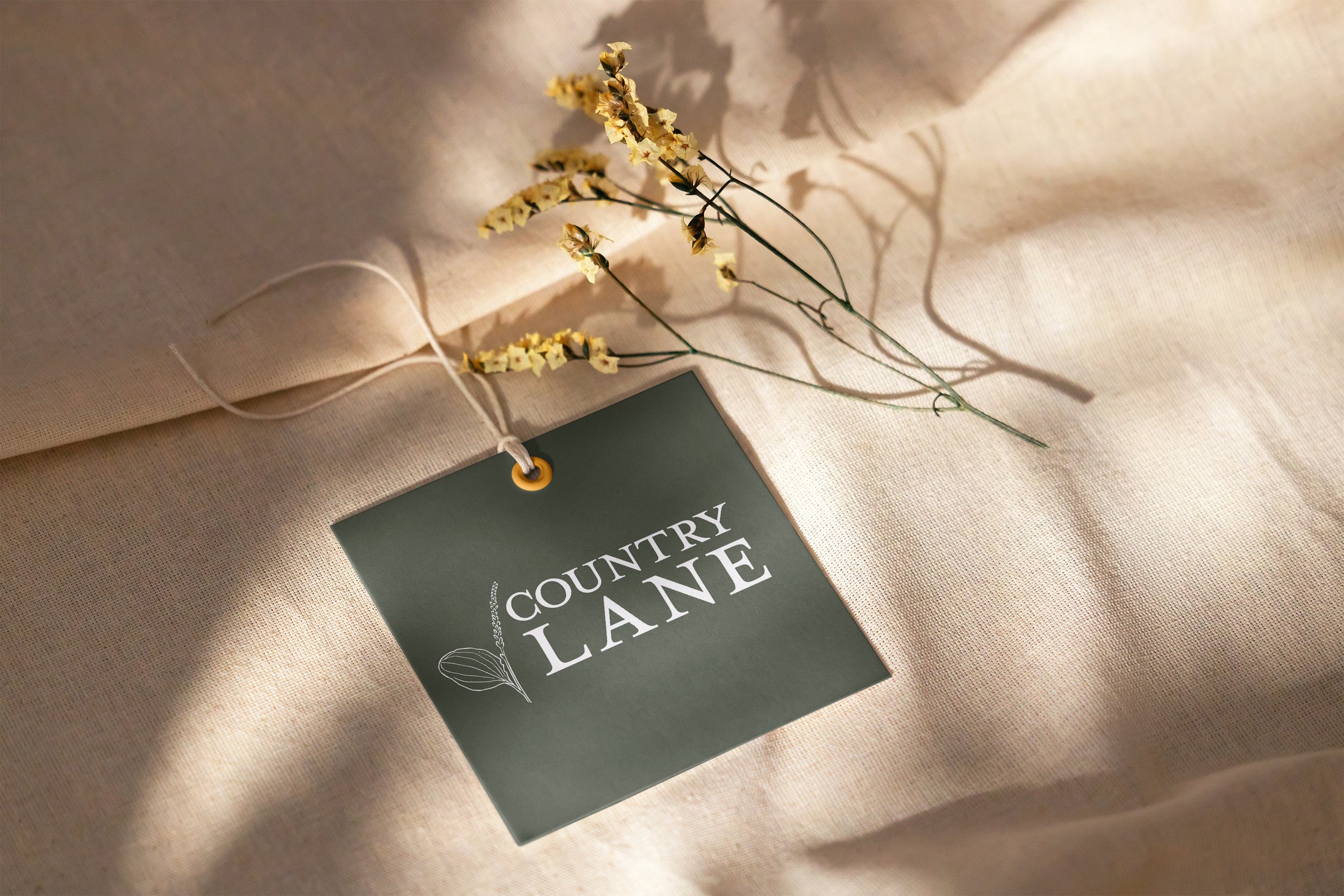
The brand required two distinct logo systems to accommodate Madi's expanding product lines. Country Lane Botanicals serves as the primary brand for her herbal wellness products (oils, tinctures, and salves), while Country Lane functions as the broader umbrella brand for her other handmade goods, including clothing and bakery items. Both needed to feel cohesive while allowing for clear differentiation.
For the botanical illustration, I hand-drew a plantain leaf and flower, carefully balancing the level of detail to ensure the mark would remain elegant and recognizable at any scale. The challenge was capturing the organic, handcrafted quality Madi wanted while maintaining the simplicity necessary for a functional logo. The illustration needed enough botanical accuracy to feel authentic without becoming overly intricate or losing clarity when scaled down for small label applications.
I selected a classic serif typeface to reinforce the timeless, traditional aesthetic Madi envisioned. Serif fonts carry a sense of heritage and craftsmanship that aligns perfectly with the careful, intentional nature of her products. The typography balances the organic botanical illustration with structure and refinement.
The challenge was capturing the organic, handcrafted quality Madi wanted while maintaining the simplicity necessary for a functional logo. The illustration needed enough botanical accuracy to feel authentic without becoming overly intricate or losing clarity when scaled down for small label applications.
I selected a classic serif typeface to reinforce the timeless, traditional aesthetic Madi envisioned. Serif fonts carry a sense of heritage and craftsmanship that aligns perfectly with the careful, intentional nature of her products. The typography balances the organic botanical illustration with structure and refinement.
The color palette was developed to support a dual-purpose system. The base palette features earthy, natural tones (deep greens, warm terracotta, soft sage, golden mustard, and cream) that ground the brand in its botanical roots and holistic values. These colors give Country Lane an approachable, natural feel that resonates with conscious consumers seeking transparency and authenticity in their wellness products.
Beyond the core brand colors, I created an extended palette designed specifically for scent identification across product labels.
Each scent category is assigned its own color, making it easy for customers to identify and differentiate products at a glance, whether they're browsing online or shopping at a market booth.
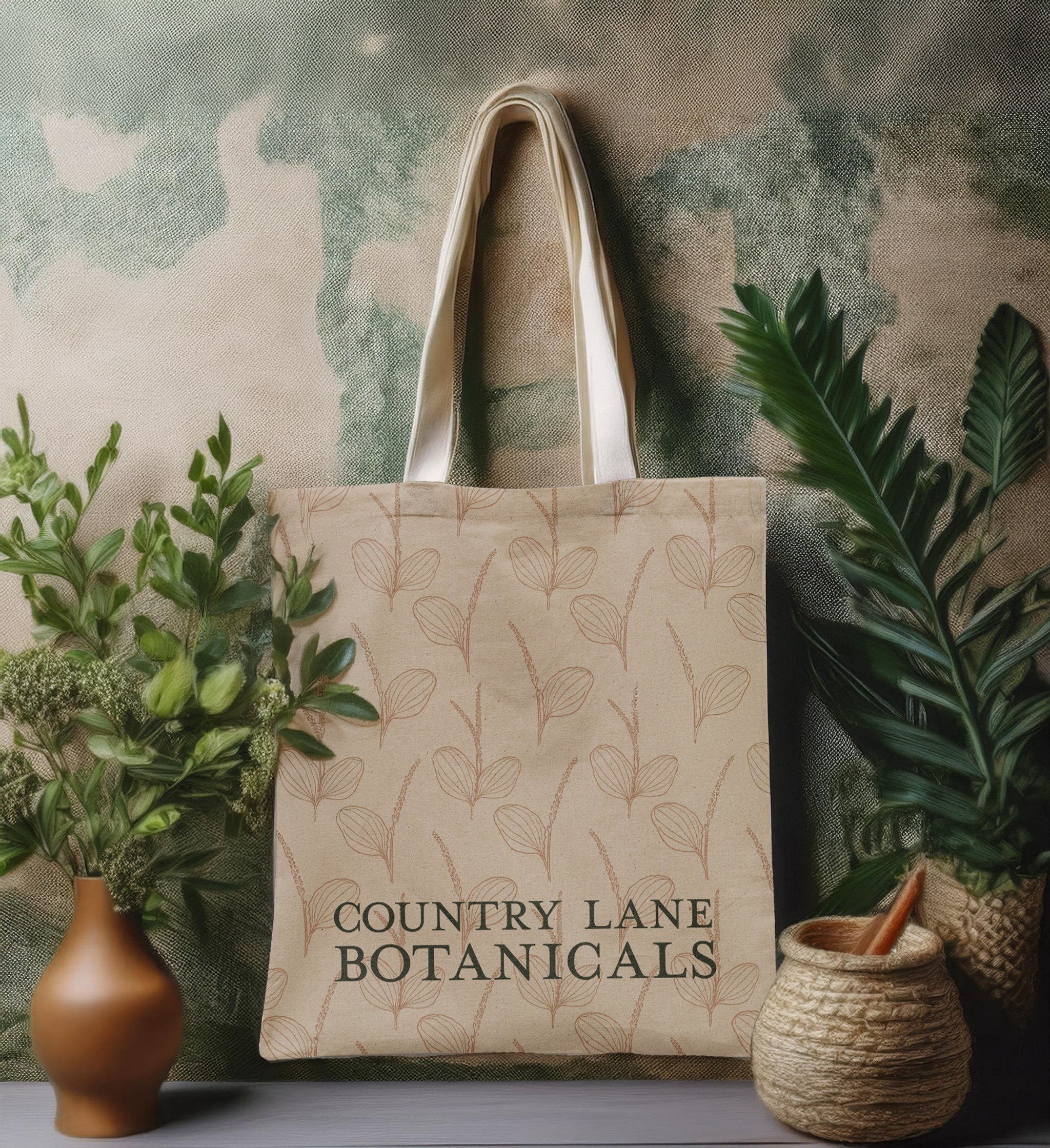
To extend the brand further, I designed a custom botanical pattern using the plantain illustration repeated and arranged in a natural, organic layout. This pattern brings visual consistency across packaging, tote bags, and other branded materials while reinforcing the handcrafted, nature-focused identity.
Deliverables included multiple logo variations for flexible application, a comprehensive color system, typography guidelines, custom label templates for various product types, and the botanical brand pattern.

Outcome
The Country Lane brand identity successfully balances simplicity with thoughtful detail, giving Madi a flexible, professional system that speaks authentically to her holistic values and artisan approach. The dual-brand structure allows her to grow her business across multiple product categories while maintaining a cohesive visual language. The botanical illustration grounds the identity in nature, while the classic typography and earthy palette create a sense of trustworthiness and timeless craftsmanship that appeals to conscious consumers seeking transparency in their wellness products.